
PROJECT BRIEF
This is a Case Study I did during my Interdisplinary workshop of Design Evaluation. This case study evaluates the usability of Happyfares, a third-party airline booking website, and proposes an interface redesign to enhance user interaction by using Heuristic Analysis & System Usability Scale Evaluation
Project Type
User Experience
Team
3 Members
Timeline
3 Weeks
PROJECT AT A GLANCE
Conducting Critical Usability and Design Evaluation to discover opportunity areas
Using frameworks like Heuristic Analysis, VIMM, NPCI and UX 5 Planes, we discovered:
There is a lack of guided navigation
UI does not evoke trust
Steers away from User Familiarity
Interface can be overwhelming and confusing
We wanted to redesign the onboarding, browsing, booking, and payment task flows of Happyfares. We also integrated a new feature of booking directly through coupons. This was translated into low- and mid fidelity screens, which were validated by 8 users to select the best iteration before prototyping
The high-fidelity prototype was tested with 9 users and scored 81.6, which is considered a good interface according to the SUS scale.
View Solution
Mapping out Task Flows, Creating Low and Mid Fidelity Wireframes & Validating Concepts
Translating Iterations into High Fidelity Prototypes and Usability Testing with System Scale Rating
THE Design Process
EMPATHIZE
Task Flow Analysis
Rating Apps
Market Research
Competitor Analysis
DEFINE
Heuristic Analysis
Problem Statement
Recommendations
IDEATE
Concept Generation & Validation
Paper Prototyping
PROTOTYPE
A/B Testing
High Fidelity Wireframing
Prototyping Screens
TEST
Usability Testing
System Scale Rating (SUS Rating)
2 1/2 Weeks
Empathizing through research
Defining Target audience
Happyfares is a third-party airline booking website. Their Value proposition is to provide affordable flights to their users
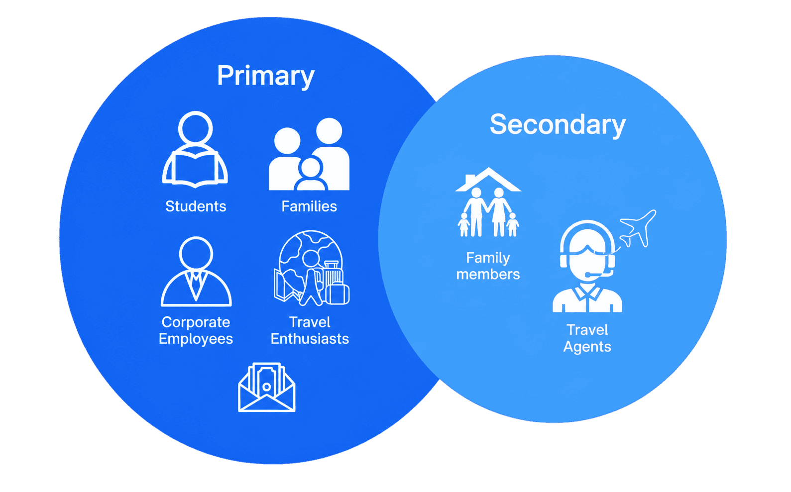
People with disposable income
Heuristic Evaluation
My Team and I conducted a comprehensive Heuristic Analysis for every feature and task flow of Happyfares. The Major Usability Issues are:
View Detailed Heuristic Evaluation

Consistency & Standards:
Users should not have to wonder whether different words, situations, or actions mean the same thing.
Issues:
Filters: Other Airline Booking websites have a sticky side banner
Pricing: There is no Price range filter
Cannot sort the prices/ option is not immediately visible
Finding the payment page is difficult
Aesthetic and Minimalist Design:
Dialogues should not contain information which is irrelevant or rarely needed.
Issues:
The colour scheme, font and icons does not reflect a trustworthy brand
Important Features not immediately visible to users like Sorting & Filters
There is a lot of text, buttons and fields displayed together — Overwelhming

Recognition Rather Than Recall
Minimise the user’s memory load by making objects, actions, and options visible.
Issues:
Abundance of Flight Information: Lots of Options User must remember the flights most optimal for them
no shortcuts or autofill options available for power users.

Flexibility and Efficiency of use
Accelerators unseen by the novice user may often speed up the interaction for the expert user
Issues:
No efficiency increasing factors
Must manually fill out the information
Have to scroll down the application for choosing the mode of payment
Regular users or frequent travelers should be offered shortcuts like pre-filled fields

We also used other methods of usability and design evaluation to critically deduce what are potential opportunity areas for redesign
VIMM Analysis
NPCI Framework
UX 5 Planes
Competitor ANalysis

*Rated out of five
Pain points discovered:
Happyfares failed to provide the basic of features.
Filters were Cluttered
Website was hard to navigate
The aesthetic does not match what they promise

dEFINING THE PROBLEM STATEMENT
User pERSONAS & SCENARIOS


USER JOURNEY MAPPING

THE PROBLEM STATEMENT
How might we redesign Happyfare’s interface and user flows to evoke trust and simplify the booking process for users?
Lack of Guided Navigation
Steers away from User Fimarility
Does not look Trustworthy
Confusing Interface
iDEATION & ITERATION
path Forward to Redesign
Choose 4 Task Flows to Re-Design and added 1 new feature
Created two low fed concept iterations of task flows, which were evaluated by teammates. Concept 2 was chosen overall
Concept 2 was translated into Mid Fed Wireframes.
All teammates’ chosen concepts were evaulated by users. My Interface achieved highest score
Developed and protoyped for System Usability Scale testing
TASK FLOWS CHOSEN TO REDEISGN
After design evaluation and problem identification, these are the four task flows we have redesigned and the new feature we have integrated:
Onboarding
Booking a Flight
Browsing for Flights
Payment for Flights
Booking through coupons
Task 3: Browsing Flights Mapped out

Task 4: Payment Process Mapped out

Task 5: Booking directly through the Coupon Page Mapped out (New Feature)

Low fidelity Wireframing
After mapping out task flows, I created two low-fidelity concept iterations of the task flows, after which my teammates evaluated them and Concept 2 was chosen over Concept 1 to be developed into Mid Fidelity Wireframes
Task 2: Booking a Flight

Concept 1
Concept 2


Task 3: Browsing Flights

Concept 1
Concept 2
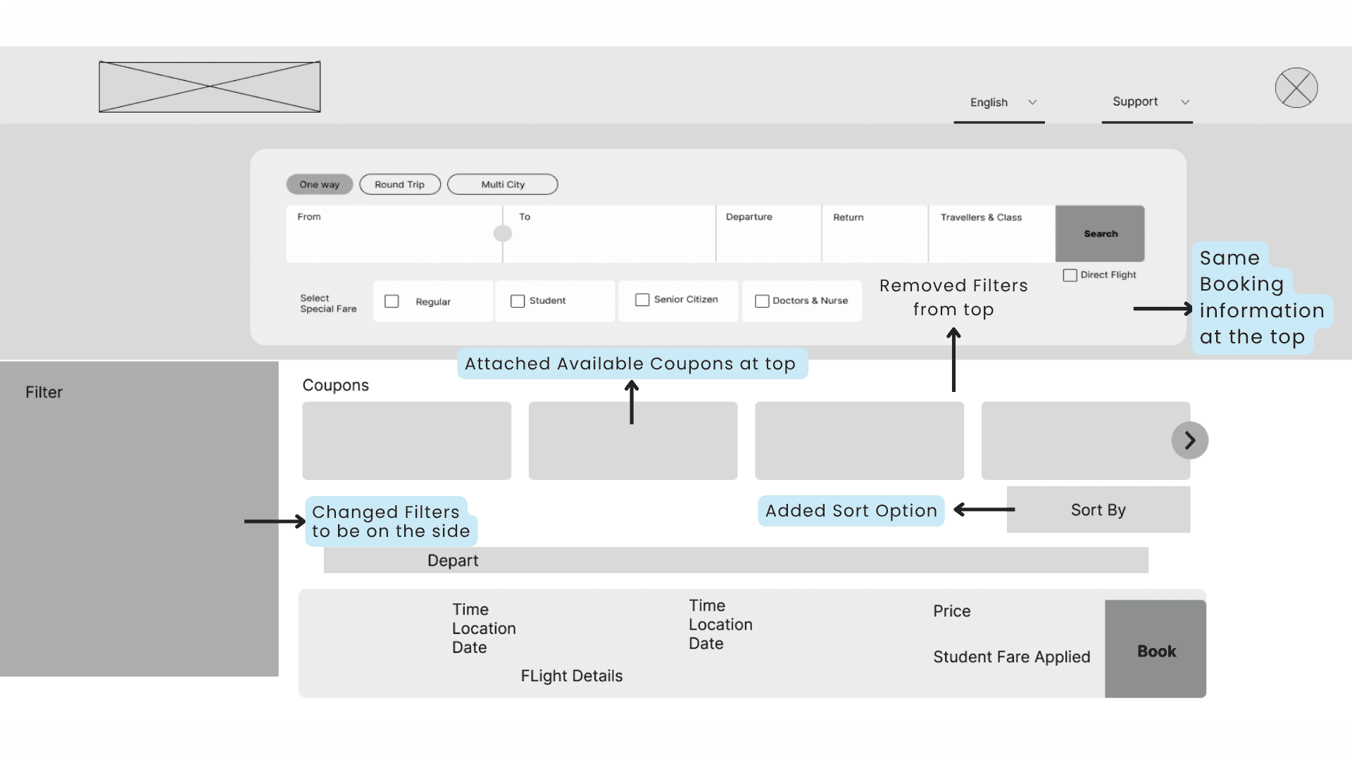

Task 4: Payment for Flights

Concept 1
Concept 2

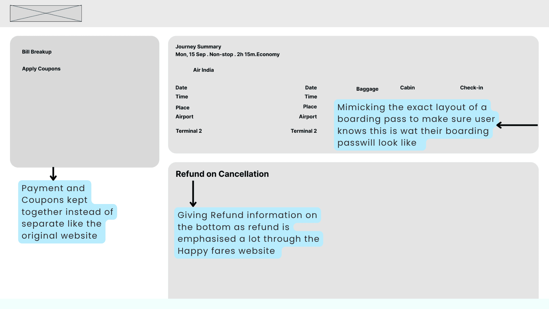
MID fidelity Wireframing


Teammate 1’s iterations
Teammate 2’s iterations


We each made three iterations of the website Tested each one with 8 users against the Semantic Analysis Scale. Out of the three iterations made the team members, mine was favoured for its layout and clear navigation
RESULTS FROM CONCEPT VALIDATION

All the concepts averaged about the same results, but stood out differently in different places. Concept 1 was appreciated for clearness and layout. Concept 2 stood out for its features and user freedom. Concept 3 stood out for its consistency.
redesigned happyfares

Insights from Usability testing

Original Interface: Coupon Page
USER TESTING SUMMARY

Features that could be added to improve User Experience:
Include a Save for Later Feature
Having Clickable Breadcrumbs
Showing the difference between Normal and Student Fare
Making the Book through Coupons more clearer with a Pop-up
No Double Click

Conclusion
Overall, the User feedback has shown that interface has a good usability score, however there are room for improvement. Usability Testing & Heuristic Analysis and the other methods have helped in recognizing major usability issues. With the minor fixes the system usability score can be brought up easily.
Averaged Score: 81.4
Verdict of Interface: Good Score Interface
WHAT I LEARNT AS A DESIGNER

Design validation is essential: Testing challenged my assumptions and reinforced the importance of designing for real users, not just myself.
Design decisions need multiple perspectives: Using different evaluation methods helped me uncover usability issues across navigation, interaction, visuals, and cognition.
Collaboration & Leadership: Working with junior teammates taught me how to lead, delegate, and guide others while keeping the team aligned and moving the project forward.